Sensors

The idea is simple:

The worse the condition of the cyclepath, the more the bicycle shakes while cycling.
The more the bicycle shakes, the more uncomfortable the cycling will be.

We can measure the shaking using accelerometer data.
We can track the paths cycled using geolocation data.
Both can be recorded using a smartphone.
Both can be associated by the timestamps in the data.

Proof of concept

In June 2021 I created a small proof-of-concept. Using the mobile application phyphox to record raw accelerometer data using my phone, which was mounted on my bicycles handlebar. At the same time I recorded a GPS trace. Merging those two datasets allowed me to create a visualization of how “smooth” my ride was on specific parts of the route (green means smooth, yellow to red means not so smooth).

My little set-up was very basic, most people already have a similar configuration when using their phone for navigation or the like.

The result can be seen here on a small example route I cycled in the east of Berlin:

A route I used to record data for my proof of concept in the Wuhletal (east of Berlin).

So, yes, it worked pretty well. The darker green points are some very smooth cycle/running paths, such as this one:

Smooth cyclepath in the Wuhletal, close to the train station of the same name. Picture taken using a GoPro during some pretty nice rain.

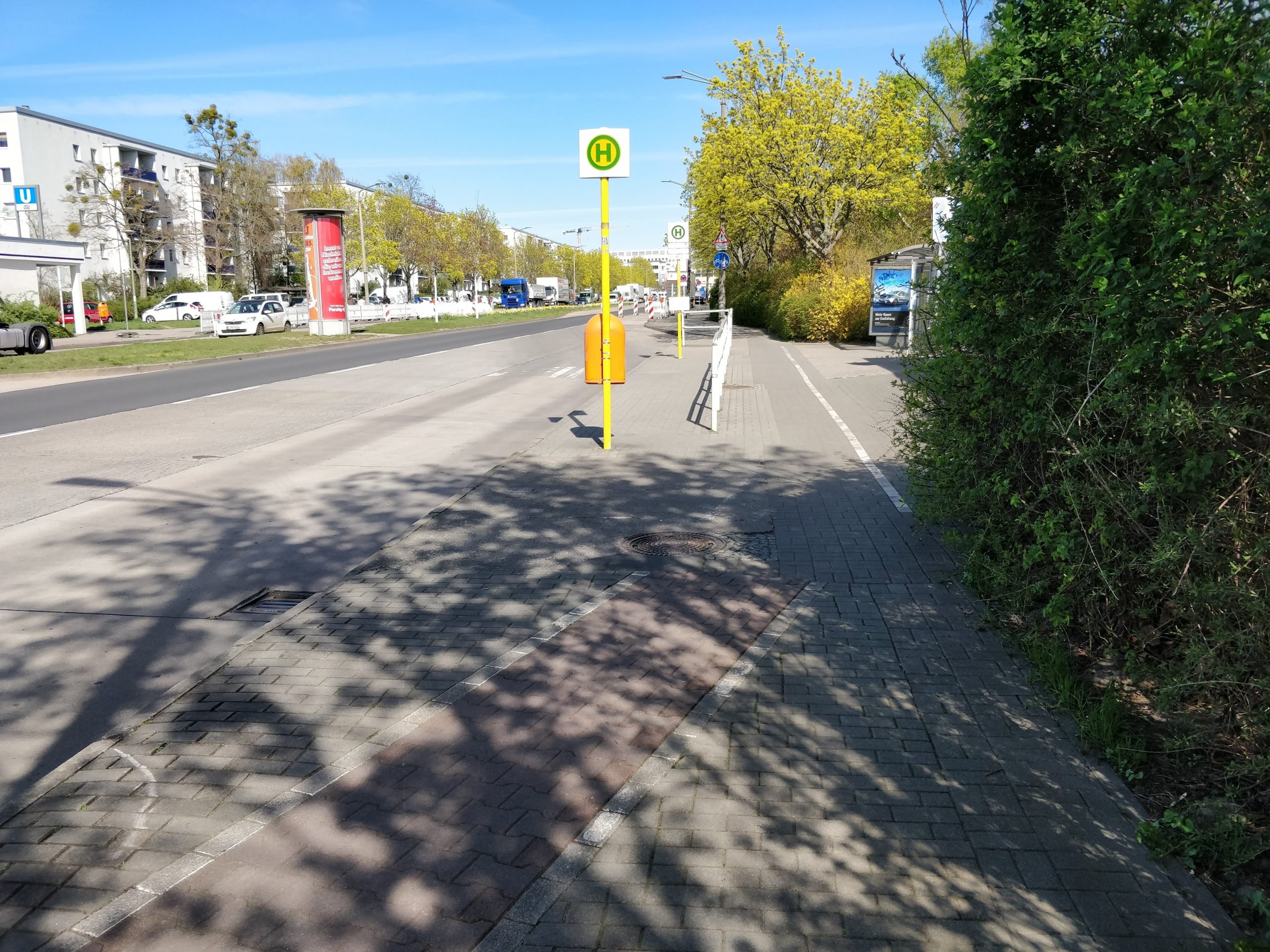
While the very heterogeneously colored points next to the U-Bahn/Metro station “Cottbusser Platz” is a cyclepath, which is in some pretty bad condition. Just have a look at this abomination of a cyclepath right next to that particular metro station, which literally eats up the pedestrian part of the way:

The slightly red bricks show the cyclepath. This picture is taken next to the metro/U-Bahn station “Cottbusser Platz” in Berlin and shows how bad the infrastructure for non-motorized participants of society can be.

The whole proof-of-concept is available as a Jupyter/Python notebook in this little repository on Github: https://github.com/Lumiukko/CyclepathConditionVisualization

The visualization, however, only shows the relative smoothness, based on that particular route.

I would really love to expand on that, but I currently lack the time, so I wanted to put my thoughts in writing. Because there are some issues…

Issues

The app. Don’t get me wrong, phyphox is a really great app and it helped me to create the proof-of-concept. However, it was originally made for physics experiments and education and does not quite fit this use-case. For one, phyphox requires itself to be actively running in the foreground to record the accelerometer data, which makes it difficult to do on a regular basis and; Secondly, running phyphox to record such raw sensor data adds a significant drain to the battery, since the sampling rate of the sensors can be quite high.

Another big issue is that the accelerometer data depends on the specific set-up used, which makes comparing the data between different users and set-ups difficult. These factors include:

  • the phone model used,
  • the mount used to attach the phone to the bicycle,
  • the bicycle itself with all components between mount and wheels / point of contact to the ground,
  • the exact trace the wheels took (even a few centimeters can make a different between a smooth ride or feeling like riding on a mogul field)
  • and the traveling speed, as faster or lower speeds may conceal certain conditions of the cyclepath, which would otherwise be visible only by looking at accelerometer data.

But don’t despair, there are some ideas how to address these problems.

Solutions

Creating a dedicated app that records accelerometer data while running in the background using a more suitable sampling rate will reduce battery drain and makes it more likely to be used on a regular basis.

This would also allow crowd-sourcing of such data. Unfortunately, merging the data is problematic, since it highly relative to the aforementioned factors. However, If cycling a very specific trace makes the difference between feeling like a milk-shake or a smooth ride, or if the bicycle configuration makes all the difference, because the phone mount may shake a little less, we could conclude that the overall experience of that cyclepath are not great. Therefore, if multiple people would cycle the same parts of a route, we could create some sort of average and create a more complete map.

Imagine the possibilities…

Addressing the issues may help to gather a large amount of data on cyclepath conditions. Such information can be used to annotate data on, for instance, OpenStreetMap. Think of route planning services for bicycle rides that use such annotations to not only suggest nice routes based on how the streets should be, but how they are in reality, based on empirical data collected by the users.

Information on the condition of a route could complement others already offered by route planning services, such as elevations and the routing itself. I would love that. Just quickly chose a route nearby for a comfortable relaxing cycle, when you’re in the mood for it 🚲

Links:

Motivation

Recently I have been wondering why we get drowsy when we work for a while in enclosed rooms. I always assumed it’s due to a lack of oxygen and searched for a method to measure the oxygen concentration in the air. After reading a few pages about people with similar ideas, I quickly learned that it is not the lack of oxygen, but rather the build-up of carbon dioxide (CO2) that creates a lack of focus, drowsiness and at some point even health issues.

The CO2 concentration in the air is measured in “parts per million” (ppm), which is something like the average number of carbon-dioxide molecules per million molecules. The limits of CO2 concentrations and their effects on humans differ slightly depending on the source, but negative effects are expected at about 1000 ppm. Health issues arise at about 2000-2500 ppm. Just as a quick reminder: The “air” is mostly nitrogen (N2, ca. 78%), oxygen (O2, ca. 21%) and carbon dioxide (CO2, ca. 0.04% = 400 ppm), plus some gases in even smaller concentrations [see Wikipedia]. Having 400 ppm as a permanent CO2 concentration in the “outside air” is actually quite alarming and was announced in 2016. No open window will help us get below this value anymore – climate change is real, at this magnitude man-made and extreeemly dangerous, so we have to deel with eet.

Measuring

Getting a sensor to measure CO2 in the air is a little on the pricey side. The sensors should be self-calibrating to be able to give accurate readings (unless you are able to calibrate them yourself). A lot of the cheaper sensors are not calibrated and can only give estimations or relative changes in CO2 concentration. Self-calibrating sensors are available from about 60-80 EUR, depending on the vendor. Examples are the Senseair K30 Sensor (just the sensor) and the TFA Dostman “AIRCO2NTROL MINI” (ready-to-go standalone device with a display).

Since the price is rather high for a personal side project born out of curiosity, I decided to go with the latter device, which I could also use in other environments (e.g. my office or our lecture hall, since it really gets stiffy in there at times). The device is powered by a micro-USB cable, which also transfers the data.

Setup

My hardware setup is basically just a Raspberry Pi connected to a router (It doesn’t matter if it’s connect via network cable or WiFi) and the CO2 Monitor connected on one of the Raspberry Pi’s USB ports. In the following picture you can see my setup:

Raspberry Pi + CO2 Monitor setup

Software / Installation

Getting the data is a little tricky, there is a software tool for Windows, but I wanted to get the data on my Raspberry Pi.

I will spare you the description of my trial and error process – what I found was this “co2mon” GitHub repository. Using the following commands worked flawlessly on Raspbian Pi (the Debian based Raspberry Pi OS).

Please note: Depending on your user permissions you may have to run these commands as root/super-user, therefore run them as “sudo”.

apt-get install cmake g++ pkg-config libhidapi-dev
git clone https://github.com/dmage/co2mon
cd co2mon
cmake .
make

For convenience I also moved the binary to the proper folder:

mv ./co2mond/co2mond /bin/co2mond

In order to get the values you simply run the command:

co2mond -u

This basically returns the data the sensor is sending via the USB cable:

CntR    839
0x4f    7240
0x52    10183
0x41    0
0x43    3411
Tamb    23.5375
0x6d    1925
0x6e    25103
0x71    840

One of these values is the CO2 concentration in ppm (CntR) and another is the temperature in degrees Celsius (Tamb).

To have a more Linux-y and, hence, easy access to those values, we can run the co2mond tool as a daemon and “store values from the sensor in datadir” (to quote the co2mond –help output).

co2mond -d -u -D /var/co2

This will continuously offer the sensor values in 3 files:

  • /var/co2/CntR = CO2 concentration in ppm (Integer number)
  • /var/co2/Tamb = Ambient temperature in °C (Decimal number / Float)
  • /var/co2/heartbeat = The Unix timestamp of the last sensor reading (Integer number)

And there we go. These files can be simply read out using your favorite programming language, or simply use cat:

cat /var/co2/CntR /var/co2/Tamb /var/co2/heartbeat

Next Steps:

In the next post I’m planning to describe how to use Python 3 with Flask and Bokeh to have an interactive plot of your ambient data, accessible via browser from anywhere in your network. It looks something like this (I also have a DHT22 temperature and humidity sensor, as you saw on the picture above):

Rasbperri Pi Ambient Sensor Plot (v1)

Legend:

  • Green = CO2 concentration in ppm (most right scale)
  • Red/Orange = Two different temperature sensors in °C (left scale)
  • Blue = Humidity in % (first right scale)